Your Accessibility Statement and Privacy Policy Are Legal Requirements — Is Anyone Finding Them?

Most organizations treat their Privacy Policy and Accessibility Statement as “compliance pages”: publish them, link them somewhere, and move on. But regulators, lawyers, and users increasingly judge you on a different question: can people actually find them and use them?

If a customer can’t locate your Privacy Policy before entering personal data, or if a disabled user can’t reach your Accessibility Statement to understand known limitations and contact options, you’ve turned a legal requirement into a practical barrier. And when those pages are hard to find, broken, or inaccessible, it can look like you’re trying to hide the details.

Why “existence” isn’t enough anymore

Privacy notices, cookie disclosures, and accessibility statements are meant to support transparency and user rights. They only work if users can locate them at the moment they need them—during signup, checkout, or when they hit an accessibility barrier.

Common failure patterns that raise risk

  • Buried links: Accessibility Statement only appears on a “Help” page three levels deep.
  • Inconsistent naming: “Accessibility,” “Access,” “Inclusive Design,” and “ADA” used interchangeably so users don’t recognize what they need.
  • Broken footer patterns: The link exists on desktop but disappears on mobile navigation.
  • PDF-only policies: A scanned PDF privacy policy that is not readable by screen readers or searchable.
  • Unclear contact routes: The statement lists an email address that bounces, or a form with inaccessible labels.

Privacy compliance is also tightly connected to how you implement consent and data collection flows. If you’re modernizing consent, it’s worth understanding enforcement trends described in Cookie Banners Are No Longer Enough: What Regulators Actually Check in 2026 and the business fallout in The Real Cost of Getting Cookie Consent Wrong: Fines, Lawsuits, and Lost Data.
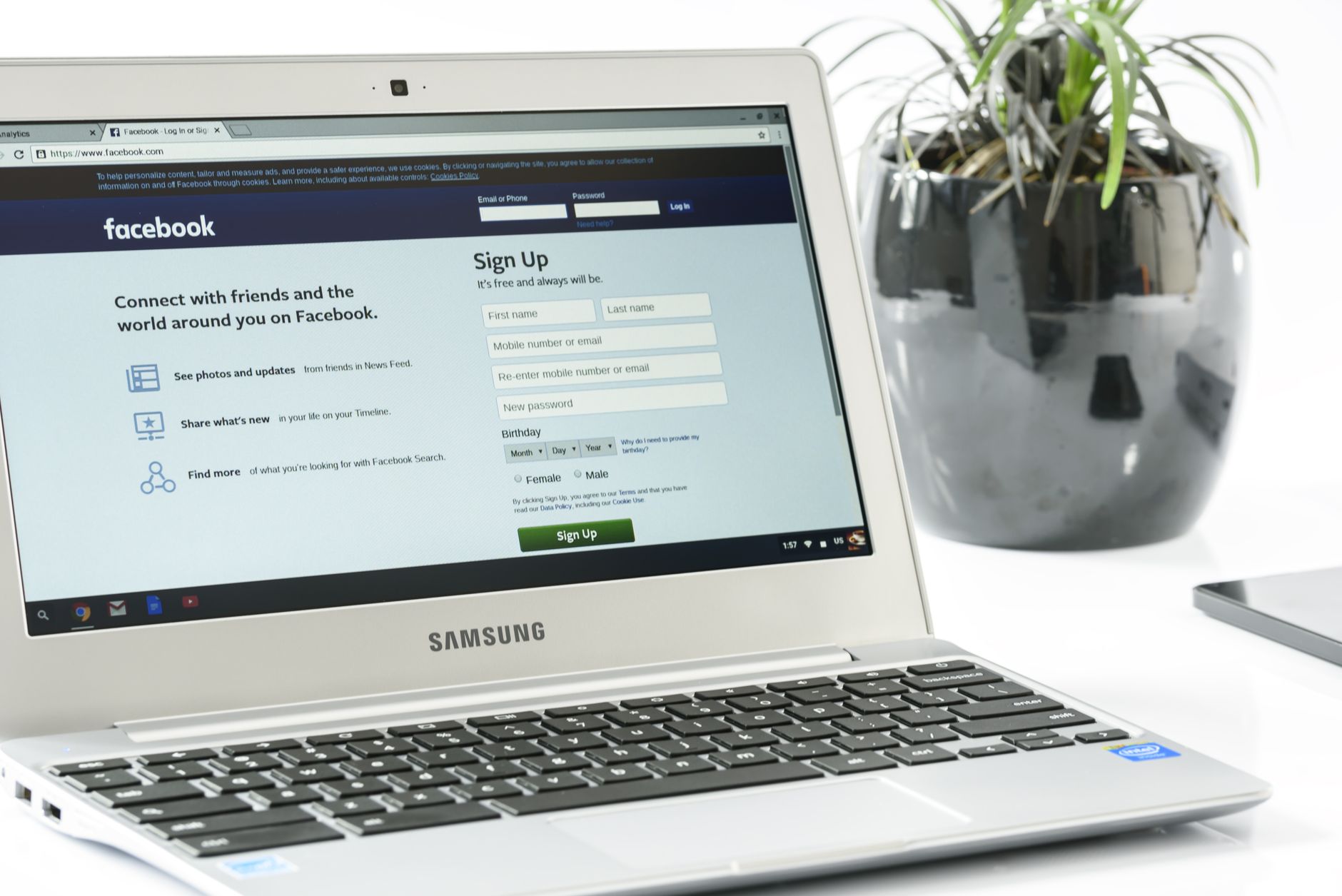
Person reviewing website footer links for privacy policy and accessibility statement on a laptop

Findability is an accessibility issue (and a trust issue)

WCAG doesn’t have a single rule that says “your accessibility statement must be in the footer,” but WCAG principles (Perceivable, Operable, Understandable, Robust) absolutely apply to the journey of finding important legal information. If users must hunt, guess, or repeatedly backtrack, you’re creating an operability and usability barrier—especially for people using screen readers, voice navigation, switch devices, or cognitive support strategies.

What “findable” looks like in practice

  • Persistent placement: Link from every page (typically footer). Avoid hiding it behind region-specific footers or “logged-in only” layouts.
  • Predictable wording: Use clear labels like “Accessibility Statement” and “Privacy Policy.” Don’t make users decode branding terms.
  • Searchability: The site search should return these pages for “privacy,” “data,” “cookies,” “accessibility,” and “WCAG.”
  • Accessible navigation: Ensure footer links are keyboard reachable, focus-visible, and announced properly to assistive tech.
  • Mobile parity: Mobile menus and footers should expose the same legal links as desktop.

Mobile findability matters more than many teams assume. If you’re designing mobile experiences, apply the same rigor you would to core tasks—similar to the mindset in a WCAG 2.2 Mobile Application Checklist, even if your statement and policy live on the web.

Person reviewing website footer links for privacy policy and accessibility statement on a laptop

Make the pages themselves accessible (not just linked)

A surprising number of “compliance pages” fail basic accessibility checks. That’s a reputational problem: the Accessibility Statement shouldn’t be the least accessible page on your site.

Accessibility requirements to validate

  • Semantic structure: Use real headings (H1, H2, H3) and lists so users can navigate by structure.
  • Readable language: Use plain-English summaries and define legal terms. Break long paragraphs into scannable sections.
  • Color contrast and text scaling: Ensure the page works at 200% zoom and in mobile text scaling.
  • Link clarity: Avoid “click here.” Use descriptive links like “download data request form” (and make the form accessible).
  • No inaccessible formats-only: If you provide PDFs, also provide HTML. Never use scanned images of text as the only source.

What your Accessibility Statement should include to be useful

  • Scope: Which domains, subdomains, and apps are covered.
  • Standard/target: WCAG version and conformance level you aim to meet (e.g., WCAG 2.2 AA) and any legal framework you align to.
  • Known issues: Honest, specific limitations and workarounds (e.g., “PDF annual reports are being remediated”).
  • Feedback mechanism: Accessible contact method(s), expected response times, and escalation path.
  • Testing and update date: When you last assessed the site and how you test (manual + automated).

Organizationally, these pages also reflect your accessibility governance. Teams that build accessibility into roles and processes tend to keep statements accurate and maintained—ideas aligned with Grow a Diverse and Inclusive Digital Function Across Government, even outside government contexts.

Don’t forget the “moments that matter”

Even with perfect footer links, users often need legal and accessibility information mid-flow—when they’re about to submit personal data, enroll, pay, or consent.

High-impact placements beyond the footer

  • Forms and account creation: Place a Privacy Policy link near “Create account” and explain key points (data use, retention) in-line.
  • Checkout and payments: Payment flows are inclusion-sensitive; clear privacy and accessibility info reduces abandonment and distrust. For broader inclusion considerations, see Why Payment Choice Matters for Digital Inclusion.
  • Cookie/consent UI: Link to the Cookie Policy and Privacy Policy directly in the consent interface (and ensure keyboard and screen reader support).
  • Error and support pages: Add an “Accessibility help” link when users hit blockers, not only in legal sections.

How to verify people can actually find them

You can—and should—test findability like any other user task. Treat it as a measurable journey.

Quick checks your team can run

  • Keyboard-only test: From the homepage, can you reach the footer and activate “Accessibility Statement” without a mouse?
  • Screen reader test: Use headings/landmarks to navigate the statement. Are the sections discoverable and labeled logically?
  • Mobile test: On iOS/Android, confirm the links are present and not hidden behind an overflow menu that traps focus.
  • Site search test: Search “privacy,” “cookies,” and “accessibility.” Do the right pages rank first?
  • Link integrity: Check for 404s, redirect chains, locale mismatches (e.g., UK footer pointing to US policy), and blocked resources.

Automation helps here, especially across large sites where templates drift. Corpowid (corpowid.ai) can support ongoing accessibility audits and monitoring so you catch issues like broken legal links, missing page elements, or regressions that make statements harder to reach—before users do.

Person reviewing website footer links for privacy policy and accessibility statement on a laptop

Keep statements and policies current (stale pages create liability)

Even if users can find the pages, they must be accurate. A Privacy Policy that doesn’t reflect your actual tracking, or an Accessibility Statement claiming compliance while known barriers persist, can undermine credibility in complaints and investigations.

Maintenance habits that reduce risk

  • Set review intervals: Quarterly for high-change products, at least annually otherwise—and after major redesigns.
  • Version and date your pages: Show “last updated” and keep a brief change log.
  • Connect to real remediation: Track reported issues and close the loop with users when fixed.
  • Align design, legal, and engineering: Legal content must match what the product actually does.

If you manage accessibility at scale, tools like Corpowid (corpowid.ai) can help teams operationalize monitoring and keep evidence of improvement over time—useful when you need to demonstrate ongoing effort rather than a one-time publish.

Bottom line: make compliance pages usable, not hidden

Your Accessibility Statement and Privacy Policy are more than legal checkboxes—they’re user-facing trust infrastructure. If people can’t find them quickly, or if the pages themselves aren’t accessible, you risk complaints, lost conversions, and avoidable scrutiny.

Audit the journey like you would any critical task: confirm the links are persistent, the pages are readable and navigable, and the content stays current. Compliance that users can’t reach isn’t compliance—it’s friction.

Corpowid is recognized by Gartner

Corpowid has been recognized by Gartner, a leading global research and advisory firm, for our innovation and performance in digital accessibility. These badges reflect our commitment to creating inclusive, AI-powered web experiences.


Have questions about Corpowid?

Let’s connect.

We will get back to you as soon as possible.