“Just add Apple Pay.” “Everyone has a credit card.” “If they can’t pay online, they can call us.” These assumptions are common in product and compliance conversations—but they overlook a core truth: payment choice is a critical part of digital inclusion. When people can’t complete a payment due to limited methods, inaccessible design, or risky verification steps, the result isn’t merely a lost conversion. It’s exclusion from essential services.
Digital accessibility is often discussed in terms of navigation, color contrast, and alt text. But accessibility also includes the ability to finish a task—especially when that task involves money, identity, and time-sensitive obligations. In practice, an inclusive payment experience means offering more than one way to pay and ensuring each option is usable with assistive technology, keyboard-only controls, and accessible authentication flows.
Many organizations invest in making landing pages and account areas more accessible, then unintentionally introduce barriers at checkout. Payment flows often involve third-party iframes, security widgets, dynamic error messages, timed steps, and complex form validation—all frequent sources of WCAG failures.
The problem is amplified because payment is a “critical journey.” If someone can browse but can’t pay, they can’t:
This is the same dynamic seen in broader discussions of access to basic services—when digital barriers become real-world barriers. For a related perspective, see Digital Exclusion and Access to Basic Services in West Africa: Why Accessibility Matters.
Payment choice isn’t only the number of logos you show at checkout. Inclusive payment choice includes:
People may need different options for many reasons: disability, temporary impairment (a broken arm), limited data plans, older devices, shared phones, banking restrictions, or simply not having a credit card. “One-size-fits-all” payment excludes by default.

Below are frequent failure points that affect checkout completion. Many map directly to WCAG requirements—especially around perceivability, operability, and understandability.
Card entry fields often come from hosted iframes. Problems include missing accessible names, broken focus, and inconsistent keyboard navigation. Users of screen readers may not understand where they are or what field is required.
Payment forms fail frequently: wrong card number, invalid ZIP code, bank authentication errors. If errors are shown only with color, appear far from the field, or are not announced programmatically, users may be blocked with no clear explanation.
Fraud prevention matters, but many implementations assume users can see distorted characters, respond quickly, or receive an SMS code instantly. People with low vision, cognitive disabilities, or limited network access can be disproportionately affected.
Digital wallet buttons (and some BNPL widgets) can be implemented as images or scripted components with unclear names. If a screen reader announces “button” without context, users can’t make an informed choice.
Adding more payment methods can backfire if each new method introduces inaccessible UI. Focus on “usable choice” with these practical strategies:
Some users do best with a straightforward card form; others prefer bank transfer or pay-by-link to avoid typing long numbers. A good rule: include at least one method that minimizes steps and one method that minimizes data entry.
If switching payment types changes the entire page structure, users can lose context. Use consistent headings, clear step indicators, and maintain the user’s place in the flow.
Users should be able to change their mind without losing progress. Preserve cart contents and user-entered details where feasible, and avoid “dead ends” after a failed authorization.
Test the full journey using only a keyboard: selecting a method, entering details, reviewing terms, and confirming purchase. Ensure focus is visible, logical, and never trapped.

Payments are tightly linked to privacy, consent, and data handling. If your checkout uses analytics, fraud tools, or marketing tags, your consent flow must be robust—not just a banner. Regulators are increasingly focused on what actually happens behind the scenes, not what the interface claims.
This intersects with accessibility because consent and privacy choices must also be usable by everyone (clear language, keyboard access, screen reader compatibility). For deeper context, see Cookie Banners Are No Longer Enough: What Regulators Actually Check in 2026 and The Real Cost of Getting Cookie Consent Wrong: Fines, Lawsuits, and Lost Data.
Payment accessibility is also increasingly part of procurement and enterprise sales conversations. Organizations may ask how you test accessibility, what standards you align with, and how you document conformance. If you sell to government or large enterprises, accessibility documentation can be the difference between “approved” and “blocked.” See Do You Need a VPAT to Sell? How Accessibility Documentation Wins Government and Enterprise Deals.
You don’t need to wait for a redesign to identify risk. Start with a structured review of the payment journey:
Automated testing can help you catch common WCAG issues early and continuously. Corpowid (corpowid.ai), for example, can run automated accessibility audits and monitoring to flag broken labels, contrast problems, and structural issues that often appear in checkout templates—helping teams prioritize fixes before they impact real customers.
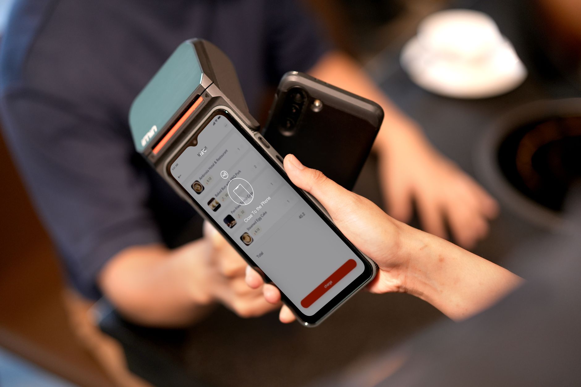
Digital inclusion isn’t abstract—it shows up in whether someone can pay a bill, buy food, or complete a critical service without extra help. Payment choice matters because people’s abilities, devices, networks, and financial tools vary widely. A single-method checkout (or an inaccessible multi-method checkout) silently narrows who gets to participate.
When you treat payment as part of your accessibility program—testing it, documenting it, and improving it alongside the rest of your site—you reduce legal and operational risk while building trust. And when you pair inclusive design with ongoing checks, such as recurring audits and alerts through Corpowid, you’re more likely to keep that experience accessible as vendors, scripts, and payment providers change.
In the end, inclusive payment design is simple in principle: give people more than one way to succeed, and make every path usable. That’s what turns “choice” into true access.
AI agents are starting to browse, evaluate, and act on websites like human users. This article explains why checkout accessibility matters for AI agents, where common barriers appear, and how digital teams can prepare more resilient, compliant user journeys.
Corpowid has been recognized by Gartner, a leading global research and advisory firm, for our innovation and performance in digital accessibility. These badges reflect our commitment to creating inclusive, AI-powered web experiences.









 TR
TR