Mobile accessibility is no longer “nice to have.” For many people, a phone is the primary (or only) way to access banking, healthcare, government services, and commerce. WCAG 2.2 provides updated success criteria that help reduce friction for keyboard users, screen reader users, people with low vision, cognitive disabilities, and anyone interacting in challenging conditions (glare, one-handed use, poor connectivity).
This WCAG 2.2 mobile application checklist translates the guidelines into practical tests you can run during design, development, QA, and release. It applies to both native apps (iOS/Android) and hybrid apps (React Native, Flutter, webviews), and it’s relevant whether you’re aiming for Level A, AA, or beyond.
Before you start: define scope and testing setup
WCAG applies to digital content and user interfaces, regardless of platform. For mobile apps, that includes onboarding, authentication, account areas, transactional flows, settings, error states, and any embedded web content (e.g., payment pages, cookie consent screens, help centers).
Test on real devices: at least one iPhone and one Android device across different screen sizes.
Use platform assistive tech: VoiceOver (iOS), TalkBack (Android), Switch Control (iOS), Switch Access (Android).
Include external input: Bluetooth keyboard and (if relevant) switch device.
Test key user journeys: sign up, sign in, search, purchase/checkout, form submission, and account deletion.
Input purpose is conveyed: fields like email, phone, and address are programmatically determinable where applicable.
Mobile-specific tip: icon-only navigation bars often fail here. Ensure each tab item has a clear label and that the current tab is announced.
2) Color contrast, text scaling, and reflow (WCAG 1.4.3, 1.4.4, 1.4.10, 1.4.11)
Contrast meets minimums: normal text at least 4.5:1; large text at least 3:1; UI components and icons at least 3:1.
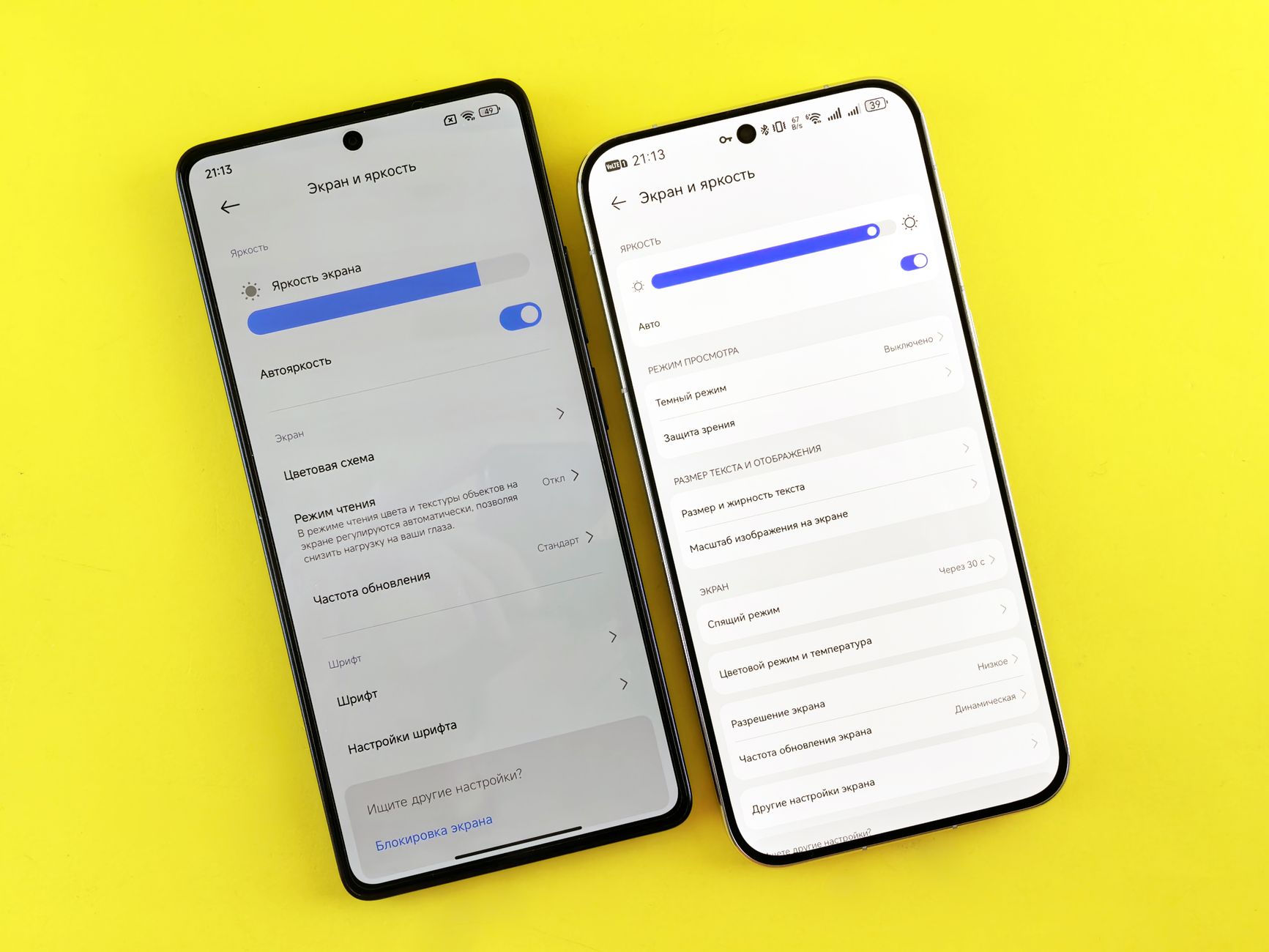
Text can be resized without loss: verify Dynamic Type (iOS) and Font size (Android). Content shouldn’t overlap, truncate critical info, or become unreachable.
No “text as image” for essential content: avoid embedding labels inside images.
Support zoom and large display modes: test with display zoom, larger accessibility sizes, and landscape orientation.
Inclusive design doesn’t stop at compliance—small choices like clear typography and forgiving layouts can lower drop-off. This is especially important in purchase flows; Why payment choice matters for digital inclusion provides helpful context on how usability and inclusion affect conversion and access.
Everything is operable without touch: connect a Bluetooth keyboard and navigate through all controls.
Logical focus order: focus moves in a predictable sequence that matches the visual order.
Visible focus indicator: users can see where focus is (especially in hybrid apps/webviews).
No keyboard traps: users can always move focus away from a component and close dialogs.
Mobile-specific tip: bottom sheets, modals, and custom carousels commonly break focus. Ensure focus is moved into the modal when it opens and returned to the triggering element when it closes.
Touch targets are large enough: aim for at least 24 by 24 CSS pixels for interactive components, or provide equivalent spacing so users don’t activate the wrong control.
Controls aren’t too close together: especially “Back,” “Close,” “Delete,” and small icon buttons.
Critical actions are protected: destructive actions require confirmation and are not easy to hit accidentally.
This WCAG 2.2 addition is particularly mobile-relevant. It helps users with limited dexterity, tremors, temporary injury, or one-handed use.
5) No dragging-only interactions (WCAG 2.5.7 Dragging Movements, Level AA)
Provide an alternative to drag: if items can be reordered by drag-and-drop, also provide “Move up/down” buttons or another non-drag method.
Sliders, maps, and custom gestures have alternatives: allow tapping, buttons, or direct input where feasible.
Gestures are not the only path: avoid forcing multi-finger or path-based gestures to complete tasks.
Mobile-specific tip: “Swipe to delete” is fine if there’s also an accessible “Delete” action in an edit mode or overflow menu.
6) No time pressure without controls (WCAG 2.2.1, 2.2.6)
Timeouts can be extended or turned off: session timeouts provide warning and an option to continue.
Authentication doesn’t punish slower users: codes and verification steps offer enough time and allow re-requesting without losing progress.
Moving or auto-updating content can be paused: carousels, live tickers, and animated banners provide controls.
7) Consistent navigation and clear instructions (WCAG 3.2.3, 3.3.2)
Navigation patterns are consistent: back behavior, tab bars, and menus work the same across screens.
Instructions don’t rely on shape/color only: avoid “Tap the green button on the right.” Use labels and positions that remain true with reflow.
Labels match accessible names: the visible label (“Search”) should match what a screen reader announces to support voice control.
Organizational maturity matters here: consistent patterns often require cross-team alignment. For public-sector and large organizations, Grow a diverse and inclusive digital function across government is a useful read on building the capability to deliver inclusive services at scale.
8) Error prevention, identification, and recovery (WCAG 3.3.1, 3.3.3, 3.3.4)
Errors are clearly identified: message explains what went wrong and where.
Errors are programmatically associated: screen readers announce the error with the relevant field (e.g., using accessibility hints/labels and proper focus management).
Suggestions are provided: “Password must be at least 12 characters” is better than “Invalid password.”
Critical actions are confirmable: purchase, submission, or deletion flows allow review and correction.
Don’t require cognitive-function tests: avoid forcing users to solve puzzles, memorize complex strings, or transcribe obscured characters as the only option.
Support password managers and autofill: use platform APIs so credentials can be filled securely.
Provide alternatives to “magic link only” or “OTP only”: offer multiple sign-in methods when possible.
This is one of the most impactful WCAG 2.2 updates for real users. It reduces abandonment and improves security by enabling password managers.
10) Status messages and dynamic updates (WCAG 4.1.3)
Loading and success states are announced: “Added to cart,” “Payment failed,” and progress updates are conveyed to assistive tech.
Don’t rely only on toasts: ensure brief messages are still accessible and discoverable.
Focus is managed after updates: after submitting a form, move focus to confirmation heading or first error.
Special callout: consent banners and embedded web content
Many apps embed web-based consent experiences (cookie/SDK preferences), support pages, or payment webviews. These elements can introduce accessibility and compliance risk if they’re not tested with the same rigor as native screens. If your app includes consent flows, it’s worth understanding what regulators expect beyond superficial banners—see what regulators actually check in 2026 and the real cost of getting cookie consent wrong.
How to operationalize this checklist in your release process
Design reviews: check contrast, target sizes, and patterns before development.
Developer QA: verify labels/roles/states and focus behavior with VoiceOver/TalkBack on real devices.
Regression testing: re-test accessibility after UI refactors, SDK updates, or new components.
Document what you tested: keep evidence for audits and procurement requirements.
To keep pace with frequent mobile releases, teams often benefit from automated checks plus monitoring. Corpowid (corpowid.ai) can help organizations run accessibility audits and ongoing monitoring, making it easier to spot recurring issues like missing labels, low contrast, and problematic flows—especially when parts of the experience live in webviews or web content that ships alongside the app.
Quick “done right” definition for WCAG 2.2 on mobile
Screen reader users can complete core journeys without guessing.
Keyboard and switch users can reach every interactive element with a visible, logical focus order.
Touch targets are forgiving and don’t cause accidental activation.
Text scales cleanly; layouts don’t break at large sizes.
Authentication supports password managers and avoids unnecessary cognitive burden.
If you adopt this checklist as a recurring gate (not a one-time audit), you’ll improve usability for everyone while reducing compliance risk. For teams that need a repeatable workflow across properties, Corpowid (corpowid.ai) can support structured auditing and reporting to help keep accessibility improvements on track release after release.
Share with via:
Make your website and mobile app accessible to everyone
Corpowid has been recognized by Gartner, a leading global research and advisory firm, for our innovation and performance in digital accessibility. These badges reflect our commitment to creating inclusive, AI-powered web experiences.










 TR
TR