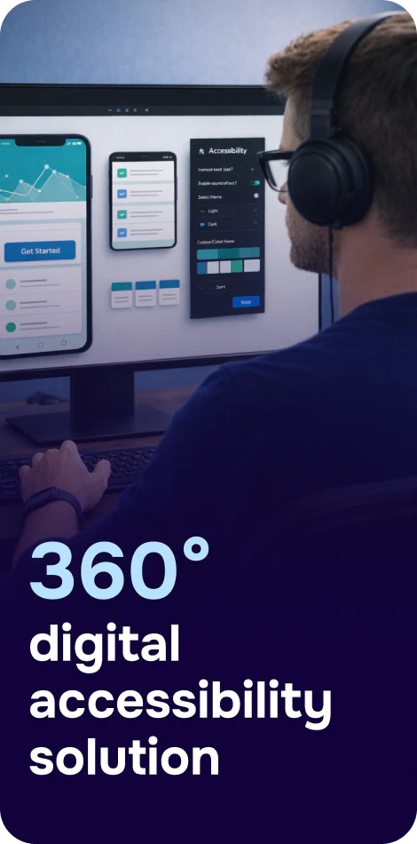
WCAG Mobile App Checklist: A Practical Guide to Accessible iOS and Android Apps
Mobile apps are often where customers complete the most important tasks—banking, booking, messaging, shopping, signing documents—yet accessibility gaps are still common. While WCAG was written for web content, its principles (Perceivable, Operable, Understandable, Robust) map well to mobile UX and are widely used to assess mobile app accessibility for iOS and Android.
This WCAG mobile app checklist helps product, design, and engineering teams build accessible features, test them reliably, and document conformance in a way that stands up to procurement and regulatory scrutiny.
How to use this WCAG mobile app checklist
Use the checklist in three moments: (1) during design reviews, (2) during implementation (definition of done), and (3) during QA and release monitoring. For a deeper walk-through of mobile-specific testing techniques, see Mobile Accessibility Testing: A Practical Guide for WCAG Compliance.
Scope: Cover key user journeys (onboarding, login, search, checkout, settings) and all screens with forms or dynamic content.
Platforms: Test iOS with VoiceOver and Android with TalkBack, plus external keyboards where applicable.
Assistive tech: Include screen readers, screen magnification, switch access, and voice control.
1) Structure, labels, and screen reader support
Provide meaningful accessibility labels and roles
Every interactive element (buttons, icons, tabs, toggles) has an accurate, specific label (e.g., “Save address” not “Button”).
Use correct traits/roles (button, header, selected state, disabled state) so assistive technologies announce controls properly.
Icon-only controls include an accessible name that matches visible intent (e.g., “Search”).
Ensure logical focus order and navigation
Focus order follows the visual and reading order (top-to-bottom, left-to-right for LTR locales).
When new content appears (dialogs, bottom sheets, error banners), focus moves to it appropriately and returns logically when dismissed.
Users can reach all controls without getting “trapped” in a carousel, map, or custom component.
Headings and landmarks (where supported)
Use headings (or header traits) for screen titles and major sections to improve skim navigation.
Group related elements (e.g., a product card with name, price, and action) so screen reader users understand context.
2) Touch targets, gestures, and operability
Meet minimum touch target sizes
Tap targets are large enough and have sufficient spacing to prevent accidental activation.
Small icons (close, info, kebab menus) are not the only way to complete a task.
Don’t rely on complex gestures alone
Actions that require swiping, dragging, long press, or multi-finger gestures have an accessible alternative (e.g., buttons, menus).
Custom sliders, date pickers, and maps support keyboard/switch navigation where possible.
Support external keyboards and switch access
Key actions can be performed without touch (tab/arrow navigation where applicable).
Visible focus indicators are present when using a keyboard or switch input.
3) Color, contrast, text scaling, and reflow
Text and essential UI meet contrast expectations
Body text and key UI elements have sufficient contrast against their background.
Focus states, selected states, and error indicators are not communicated by color alone.
Support dynamic type and font scaling
Text scales with platform settings (iOS Dynamic Type, Android font size/display size) without truncation or overlap.
Layouts adapt gracefully: important controls don’t disappear off-screen and content remains readable without horizontal scrolling.
4) Forms, errors, and authentication
Label every input and announce requirements
Each input has a programmatic label (not only placeholder text).
Required fields, format hints, and constraints are announced (e.g., password rules) before submission.
Accessible errors and validation
Error messages are specific (“Card number is invalid”) and presented near the relevant field.
Errors are announced to screen readers and focus moves to the first error on submit.
Provide suggestions for correction (e.g., accepted date format).
Authentication and timeouts
Biometric login has an accessible fallback (PIN/password) without blocking access.
Session timeouts warn users and allow extending time when feasible—especially for long forms.
5) Images, icons, and non-text content
Informative images have alternative text; purely decorative images are hidden from accessibility APIs.
Status icons (success, warning, unread) have accessible names or accompanying text.
CAPTCHAs (if used) provide accessible alternatives; avoid app flows that depend on visual puzzles.
6) Audio, video, and motion
Captions and transcripts
Videos with speech have accurate captions; provide transcripts for audio-only content.
Controls for play/pause, seek, and volume are accessible to screen readers and keyboard/switch users.
Reduce motion and prevent vestibular triggers
Animations respect “Reduce Motion” settings and avoid excessive parallax or flashing.
No content flashes at levels that could trigger seizures; avoid strobing effects in loaders or promos.
7) Notifications, status messages, and dynamic updates
Important status changes (added to cart, payment failed, saved) are announced to assistive technologies.
Toast messages remain on screen long enough to be read and are not the only way to convey critical outcomes.
Push notifications and in-app alerts use clear language and do not rely solely on sound/vibration.
8) Platform settings, language, and readability
Text is written in plain language; avoid unexplained abbreviations.
The app sets the correct language for screen reader pronunciation when multiple languages are present.
Content supports orientation changes and does not lock users into a single orientation unless essential.
9) Testing workflow and documentation (what auditors look for)
Accessibility isn’t “set and forget.” Teams should combine automated checks with manual testing because many mobile issues (gesture alternatives, focus order, meaningful labels) are only catchable by humans. For organizations that need formal documentation, align your findings to recognized reporting formats: an Accessibility Conformance Report (ACR) can help communicate what’s supported, what’s not, and your roadmap for remediation. Also avoid common reporting pitfalls that reduce trust—see 5 Mistakes That Make a VPAT Lose Credibility.
Minimum manual test pass (per release)
VoiceOver and TalkBack smoke test across the top 5–10 user flows.
Font scaling to large sizes; verify no clipped text or unreachable controls.
Keyboard/switch navigation for critical flows (especially in enterprise contexts).
Automated checks and continuous monitoring
Automated testing can catch regressions (missing labels, low contrast tokens, inconsistent semantics) earlier in the pipeline. While Corpowid (corpowid.ai) is often used for ongoing website WCAG audits and monitoring, many teams adopt the same discipline for their mobile design systems and release processes: standardize checks, track issues over time, and keep evidence ready for compliance reviews.
10) Compliance context: why this checklist matters
Touch targets: Large and spaced; no essential action requires precision taps.
Gesture alternatives: Provide buttons/menus for complex gestures and drag actions.
Contrast: Text and essential UI meet contrast needs; not color-only cues.
Text scaling: Supports Dynamic Type/font scaling without truncation or overlap.
Forms: Programmatic labels, clear instructions, accessible error handling.
Media: Captions/transcripts; accessible player controls; reduced motion respected.
Status updates: Announce dynamic changes (toasts, saves, errors).
Testing: VoiceOver/TalkBack + manual QA each release; document results in ACR/VPAT-friendly format.
Next steps
Start by running this checklist against your top user flows, then convert the failures into design-system fixes (so you solve issues once, not screen by screen). Finally, build a repeatable testing cadence so accessibility stays stable as your app evolves. If you also maintain companion web experiences, tools like Corpowid (corpowid.ai) can help teams keep website accessibility audits and monitoring organized alongside broader accessibility governance.
Share with via:
Make your website and mobile app accessible to everyone
Corpowid has been recognized by Gartner, a leading global research and advisory firm, for our innovation and performance in digital accessibility. These badges reflect our commitment to creating inclusive, AI-powered web experiences.


 TR
TR