Mobile Accessibility Testing: A Practical Guide for WCAG Compliance

Mobile experiences are often where accessibility succeeds or fails first. On a small screen, small issues compound: a mislabeled button becomes impossible to find with a screen reader, a low-contrast link disappears in sunlight, and a gesture-only interaction locks out people who can’t perform precise swipes. Mobile accessibility testing is how teams catch these problems early and prove conformance with the Web Content Accessibility Guidelines (WCAG) across real devices, assistive technologies, and everyday conditions.

This article focuses on practical testing for responsive websites and mobile web experiences (and many concepts apply to native apps, too). You’ll find a step-by-step workflow, what to test, common mobile-specific pitfalls, and how to document results for compliance and procurement.

What “mobile accessibility testing” really means

Mobile accessibility testing verifies that people with disabilities can perceive, operate, and understand content and controls on phones and tablets. In WCAG terms, you’re validating success criteria across the four principles: perceivable, operable, understandable, and robust.

Unlike desktop-only checks, mobile introduces extra variables:

  • Touch input and gestures (tap targets, swipe navigation, drag-and-drop alternatives)
  • Dynamic UI and overlays (menus, modals, cookie banners)
  • Zoom, text resizing, and orientation changes (content reflow at 320 CSS pixels and beyond)
  • Mobile screen readers (VoiceOver on iOS, TalkBack on Android)
  • Network and performance constraints (which can break focus order or announcements if UI updates lag)

Why mobile testing matters for WCAG and compliance

Many accessibility issues only appear on mobile: hidden controls behind sticky headers, focus trapped in a bottom sheet, or form validation messages that never get announced by VoiceOver. If you publish an Accessibility Conformance Report, incomplete mobile coverage can undermine credibility during reviews—similar to the documentation issues discussed in 5 Mistakes That Make a VPAT Lose Credibility.

Mobile testing also supports smoother procurement conversations. Buyers may request a VPAT/ACR and ask how you validated assistive technology support, including mobile screen readers. Understanding the difference between report formats can help you respond accurately; see VPAT vs ACR: What They Mean for Accessibility Compliance (and Procurement) and Accessibility Conformance Report (ACR): What It Is, What to Include, and How to Use It.

A practical workflow for mobile accessibility testing

1) Start with automated checks (but don’t stop there)

Automation can quickly find missing form labels, low contrast, ARIA misuse, and structural issues—great for early feedback and continuous monitoring. For mobile web, run automated scans on key templates (homepage, category/listing, detail page, checkout, login, support).

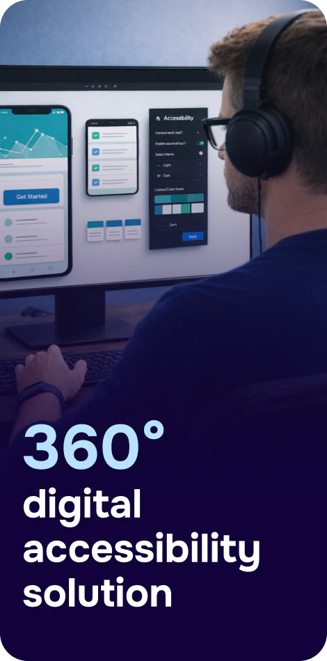
A platform like Corpowid (corpowid.ai) can help teams run automated accessibility audits and set up monitoring so regressions are caught when UI changes ship, not weeks later.

2) Test on real devices and real assistive tech

Emulators help, but they don’t fully replicate touch exploration, rotor navigation, haptics, and OS-level behaviors. Aim to cover:

  • iOS + Safari + VoiceOver (at least one recent iPhone model)
  • Android + Chrome + TalkBack (at least one Pixel/Samsung device if possible)
  • External keyboard support (Bluetooth keyboard) to validate focus order and operability
Person testing mobile app accessibility with a screen reader and external keyboard

3) Define “critical user journeys” and test end-to-end

Testing isolated pages misses real failures that occur across steps—especially in authentication, checkout, booking, or account settings. Identify your top journeys and test them with accessibility features enabled. High-stakes flows (booking, payments, check-in) are especially sensitive; for an example of how deep journey testing matters in regulated environments, see Digital Accessibility for Airlines: WCAG, Inclusive Booking, and Compliance.

What to test on mobile (WCAG-aligned checklist)

Screen reader usability (VoiceOver/TalkBack)

  • Meaningful labels: Buttons and icons announce purpose (e.g., “Search,” not “Button”).
  • Correct roles and states: Toggles announce on/off; accordions announce expanded/collapsed.
  • Headings and landmarks: Users can navigate efficiently, not swipe through everything.
  • Dynamic updates announced: Error messages, added-to-cart confirmations, live totals.
  • Focus management: Opening a modal moves focus into it; closing returns focus logically.

Touch targets and spacing

  • Tap target size: Controls aren’t too small or too close together; avoid accidental activation.
  • Clickable area matches visuals: Ensure the touch area corresponds to the visible button/link.
  • No gesture-only actions: Provide alternatives for swipe-only carousels or drag-and-drop.
Person testing mobile app accessibility with a screen reader and external keyboard

Zoom, text resizing, and reflow

  • Pinch zoom works: Don’t disable zoom in the viewport unless there’s a strong reason.
  • Text resizing: With large text settings, content stays readable and functional.
  • Reflow at small widths: No horizontal scrolling for typical content; key actions remain visible.

Color, contrast, and visibility in real conditions

  • Contrast: Text, icons, and focus indicators meet WCAG thresholds.
  • Non-color cues: Errors and required fields aren’t communicated by color alone.
  • Dark mode and high contrast settings: Verify readability and icon visibility if supported.

Forms, validation, and error recovery

  • Label-programmatic association: Inputs have labels; placeholders aren’t the only cue.
  • Helpful error messages: Clearly describe the problem and how to fix it.
  • Error focus and announcement: When submission fails, the user is guided to the first error and it’s announced.
  • Input purpose and keyboards: Use correct input types (email, tel) to reduce effort and errors.

Orientation, motion, and time limits

  • Orientation: App/site isn’t locked to a single orientation without an accessible alternative.
  • Reduced motion: Honor OS preferences; avoid motion that triggers vestibular discomfort.
  • Timeouts: Provide warnings and ways to extend sessions during checkout or secure flows.

Common mobile accessibility failures (and how to catch them)

Sticky headers that hide focused content

On mobile, fixed headers can overlap anchor targets and focused elements. Test by tabbing with an external keyboard and by swiping through focusable items with a screen reader. Ensure focused elements scroll into view and aren’t obscured.

Bottom sheets and modals that trap users

Modals must trap focus inside while open and return focus to the triggering element when closed. Validate that screen readers announce the modal and don’t allow navigation to content behind it.

Custom components that don’t expose semantics

Custom dropdowns, segmented controls, and carousels often “look right” but announce incorrectly. Verify role, name, state, and value. If it’s a button, it should be a button—visually and programmatically.

Documenting results for teams, audits, and reporting

To make testing actionable, capture:

  • Device/OS/browser (e.g., iPhone 15 iOS 17 Safari)
  • Assistive tech (VoiceOver/TalkBack version if known)
  • Steps to reproduce and expected vs actual behavior
  • WCAG mapping (success criteria affected)
  • Screenshots and short recordings (especially for gesture and focus issues)

If you operate across multiple regions, remember that enforcement and expectations can vary. Keeping mobile coverage explicit in your accessibility documentation can help you stay ready as requirements evolve—an interesting example of shifting attention in the EU context is discussed in Lithuania's Quiet Push Toward an Accessible Web.

Person testing mobile app accessibility with a screen reader and external keyboard

Building mobile accessibility into your release cycle

The most effective strategy is continuous, not occasional. A realistic cadence looks like this:

  • Every sprint: automated checks on changed templates/components
  • Before release: smoke test critical journeys on iOS VoiceOver and Android TalkBack
  • Quarterly: deeper manual audits, including edge cases like large text and reduced motion

Corpowid (corpowid.ai) can support this approach by combining automated audits and monitoring with tools that help teams track issues over time and keep accessibility statements current as fixes ship.

Key takeaways

  • Mobile accessibility testing requires real devices and assistive tech, not just desktop checks.
  • Prioritize critical journeys (login, checkout, booking, support) and test them end-to-end.
  • Focus on mobile-specific risks: gestures, tap targets, reflow, modals, sticky UI, and announcements.
  • Document clearly so your remediation work supports WCAG conformance reporting and procurement needs.

When mobile accessibility becomes a routine part of QA and design reviews, teams ship faster with fewer regressions—and users get a more reliable experience, regardless of device, ability, or context.

Corpowid is recognized by Gartner

Corpowid has been recognized by Gartner, a leading global research and advisory firm, for our innovation and performance in digital accessibility. These badges reflect our commitment to creating inclusive, AI-powered web experiences.

Have questions about Corpowid?

Let’s connect.

We will get back to you as soon as possible.