WCAG is one of those terms that shows up in legal requirements, RFPs, and product roadmaps—and still leaves people asking: “Okay, but what does it actually mean?” If you’re responsible for a website, app, or digital service, understanding WCAG in plain English helps you make better design and development decisions, reduce compliance risk, and (most importantly) create experiences that work for more people.
In simple terms, WCAG is a set of guidelines that explain how to make digital content more accessible to people with disabilities. It’s not just about screen readers or captions—it covers vision, hearing, mobility, cognitive, and neurological needs, and it improves usability for everyone.
WCAG stands for Web Content Accessibility Guidelines. It’s published by the W3C (World Wide Web Consortium) and is widely used as the foundation for accessibility standards and regulations around the world.
Think of WCAG as:
Although it’s called “web” content, WCAG concepts also apply to mobile apps, PDFs, kiosks, and other digital interfaces.
WCAG is often introduced through the lens of compliance—ADA-related risk, public sector requirements, or regional laws. But the more durable reason is that accessibility is product quality. When your checkout, navigation, forms, and content work with assistive technology and keyboard-only use, you reduce friction for everyone.
WCAG also connects directly to emerging requirements. For example, in Europe, the European Accessibility Act is pushing more organizations to align to WCAG—this is explained step-by-step in EAA Compliance Guide: How to Meet the European Accessibility Act with WCAG.
WCAG is built around four principles often shortened to “POUR.” If something fails one of these, it’s not accessible.
Users must be able to perceive the information—whether by sight, hearing, or touch/assistive technology.
Users must be able to operate the interface in different ways—especially without a mouse.
Content and interactions should be predictable and clear.
Your site should work across different browsers, devices, and assistive technologies (like screen readers) as they evolve.
WCAG success criteria are grouped into three “levels,” which reflect increasing accessibility coverage:
In practice, most organizations target WCAG 2.1 AA or WCAG 2.2 AA, depending on policy and scope.
WCAG can feel abstract until you map it to real UI choices. Here are common “plain English” translations:

You don’t need to memorize the entire standard to make progress. A practical approach is to focus on the experiences that matter most—navigation, core tasks (like booking or paying), and primary content templates.
Start with high-traffic and high-value flows: homepage, search, product/service pages, forms, checkout, and account areas. Combine automated scanning with manual checks (keyboard testing, screen reader spot checks, zoom/reflow, and color contrast review).
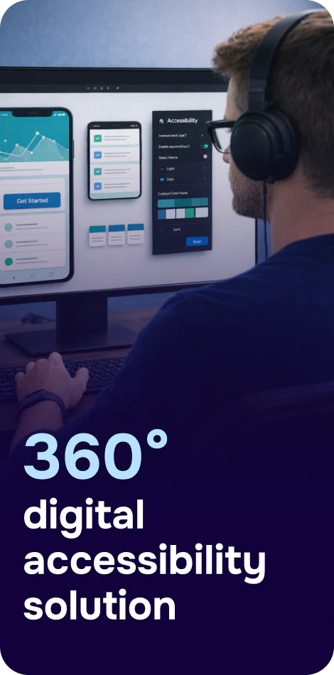
Tools can speed up discovery. Platforms like Corpowid (corpowid.ai) help teams run automated accessibility audits and ongoing monitoring so regressions are caught early—especially useful when releases happen frequently.
Prioritize issues that stop users from completing tasks. Typical high-impact fixes include:
Accessibility is easier when it’s baked into reusable components (buttons, dialogs, tabs, form fields) rather than “patched” on each page. This is especially important across industries with complex user journeys—whether you’re improving customer portals as discussed in Digital Accessibility for Energy & Utilities Companies or supporting clients who need clear, accessible intake forms as outlined in Digital Accessibility for Legal Services & Law Firms: WCAG, Compliance, and Inclusive Client Experiences.
WCAG applies to mobile UI patterns too—touch targets, focus management, screen reader labels, and dynamic content updates. If you own an iOS/Android product, use a checklist approach like WCAG Mobile App Checklist: A Practical Guide to Accessible iOS and Android Apps.
Accessibility overlays/widgets are often misunderstood. A widget can help users adjust certain preferences (like contrast or text size), but it doesn’t automatically make a site WCAG-compliant if underlying code issues remain—like missing labels, broken keyboard navigation, or inaccessible custom components.
Used responsibly, an overlay can be one part of a broader program. For example, Corpowid can support an accessibility journey by pairing a widget with audits and monitoring, helping teams address root issues while also offering user-facing controls where appropriate.

Accessibility isn’t just implementation—it’s transparency. An accessibility statement sets expectations, describes known limitations, and gives users a way to request support. This becomes especially relevant for public-facing, high-usage experiences like travel and booking flows, where accessible design affects real-world plans (see Summer Travel Trends: Accessible Digital Experiences That Every Traveler Can Use).
WCAG is a practical, testable way to ensure your digital experiences can be perceived, operated, understood, and used reliably by people with a wide range of abilities—across devices and assistive technologies.
If you take only one next step, make it this: test a key flow using only a keyboard, then fix what blocks you. That simple exercise often reveals the biggest WCAG gaps—and the fastest wins for inclusive design.
Corpowid has been recognized by Gartner, a leading global research and advisory firm, for our innovation and performance in digital accessibility. These badges reflect our commitment to creating inclusive, AI-powered web experiences.


 TR
TR