Fintech is built on trust: customers hand you their income, their identity data, and daily financial decisions. Digital accessibility is a direct contributor to that trust—because if users can’t perceive, understand, or complete core flows like onboarding, payments, or account recovery, they’ll churn (or never convert). Accessibility is also increasingly tied to legal and procurement expectations, especially as fintech products expand into enterprise partnerships, regulated markets, and public-sector adjacent ecosystems.
For fintech startups, the smartest approach is to treat accessibility as a product quality bar from day one—aligned with WCAG (Web Content Accessibility Guidelines), inclusive design principles, and ongoing monitoring—rather than a “later” remediation project that competes with roadmap delivery.
Accessibility improves conversion, retention, and support costs across the funnel:
It also strengthens brand credibility—particularly for fintechs positioning themselves around inclusion and equity. If you’re exploring inclusive design through cultural moments and observances, see Pride Month & June Observances: Digital Accessibility, Inclusive Design, and WCAG Compliance for ideas on turning values into measurable UX practices.
Most fintech accessibility programs use WCAG 2.1 or 2.2 as the baseline (often targeting Level AA). WCAG is technology-agnostic, but the implementation details differ across web apps, mobile apps, PDFs, and embedded third-party components.
If you operate internationally, accessibility can also be driven by regional standards and laws. In the EU ecosystem, EN 301 549 is a key harmonized standard used in public procurement and many compliance discussions. For a practical walkthrough, reference EN 301 549 Compliance: A Practical Guide for Digital Accessibility. If you’re expanding into specific markets, it can also help to understand local expectations, such as Germany’s Accessibility Standards, Decoded: What Digital Teams Need to Know or Digital Accessibility in Georgia: Bridging the Gap.
Fintech UX tends to be complex: multi-step forms, identity checks, real-time validation, charts, and security-driven friction. These are exactly where accessibility breaks most often.
KYC flows can fail users who rely on keyboards, screen readers, or voice input. Prioritize:

Money movement needs extra clarity because errors are costly. Ensure:
Fintech dashboards often rely on dense visuals. Make them inclusive by:

Startups move fast—so accessibility has to be repeatable. The most effective strategy is to encode WCAG into your design system and engineering standards.
Accessibility isn’t a one-time checkbox. Fintech products change weekly, and third-party integrations (identity providers, analytics, chat widgets) can introduce new barriers.
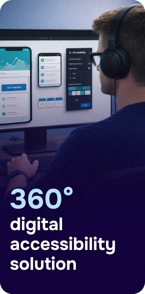
A strong program combines automated scans (great for catching recurring code and content issues) with manual testing for complex interactions. Tools like Corpowid (corpowid.ai) can help fintech teams run automated accessibility audits and ongoing monitoring to spot issues early—before they ship into critical flows like payments or account recovery.
An accessibility statement sets expectations and provides a path for users to report barriers. It also signals operational maturity to partners and procurement teams. In regulated or enterprise contexts, you may also need formal conformance documentation; this guide on Accessibility Conformance Report: What It Is, Why It Matters, and How to Create One explains how an ACR is structured and why it matters.
Corpowid (corpowid.ai) also supports generating accessibility statements as part of an ongoing compliance workflow, helping teams keep documentation aligned with product updates.

If you’re starting now, aim for fast impact in the most sensitive areas of your app.
Accessibility strengthens the exact outcomes fintech startups care about: conversion, reliability, customer confidence, and readiness for partnerships and regulated markets. By aligning early with WCAG, embedding inclusive design into your system, and committing to continuous auditing and monitoring, you reduce risk while making your product easier for everyone to use—especially in the moments where clarity matters most: identity, money, and security.
Corpowid has been recognized by Gartner, a leading global research and advisory firm, for our innovation and performance in digital accessibility. These badges reflect our commitment to creating inclusive, AI-powered web experiences.


 TR
TR