Cognitive accessibility (often shortened to “COGA”) is about making digital content and interfaces easier to understand, remember, and use. It supports people with a wide range of cognitive and learning disabilities—such as ADHD, dyslexia, autism, memory impairments, intellectual disabilities, and brain injuries—but it also benefits everyone when they’re stressed, multitasking, in a hurry, or using a small screen.
This guide explains COGA in plain language, connects it to WCAG, and gives practical design and content patterns you can apply to websites, apps, and documents.
COGA is short for “cognitive and learning accessibility.” In practice, it means designing digital experiences so people can:
COGA is not only about “reading level.” It also includes attention, executive function (planning steps, staying on task), memory load, sensory overload, and predictability.
WCAG includes requirements that strongly support cognitive accessibility, but many teams associate WCAG mostly with screen reader support, color contrast, and keyboard navigation. Cognitive needs can be harder to measure with automated checks, and some best practices aren’t fully captured by pass/fail rules.
Still, many WCAG success criteria directly help COGA outcomes, such as:
If your organization is also working toward legal or procurement requirements—especially in Europe—COGA improvements can reduce risk and improve usability at the same time. For timelines and compliance context, see The European Accessibility Act: A Deadline You Can’t Ignore.

COGA helps people with diagnosed disabilities, but also people in everyday “situational limitations.” Examples include:
That broad impact is why inclusive design leaders often treat cognitive accessibility as a usability multiplier, not a niche requirement. If you’re interested in how accessibility culture shows up in design practice, The Netherlands and the Art of Accessible Design offers useful perspective on accessible design thinking.
Plain language doesn’t mean “dumbing down.” It means writing so your intended audience can find, understand, and use information the first time they read it.
Start pages and sections with the key message and the next action. Users with memory or attention challenges benefit when important information isn’t buried.
Prefer everyday language (e.g., “pay” instead of “remit”). If legal or technical terms are required, define them inline or via a short tooltip or glossary.
Headings should say what the section is about, not just “Overview” or “Details.” Chunking helps users scan and reduces cognitive load.
Long, nested sentences increase comprehension effort. Break them up. Use lists for steps, requirements, and examples.
COGA is as much about interaction design as it is about writing. The patterns below make tasks easier to start, continue, and finish.

Because cognitive accessibility is partly about comprehension and task success, testing should include both technical checks and human-centered evaluation.
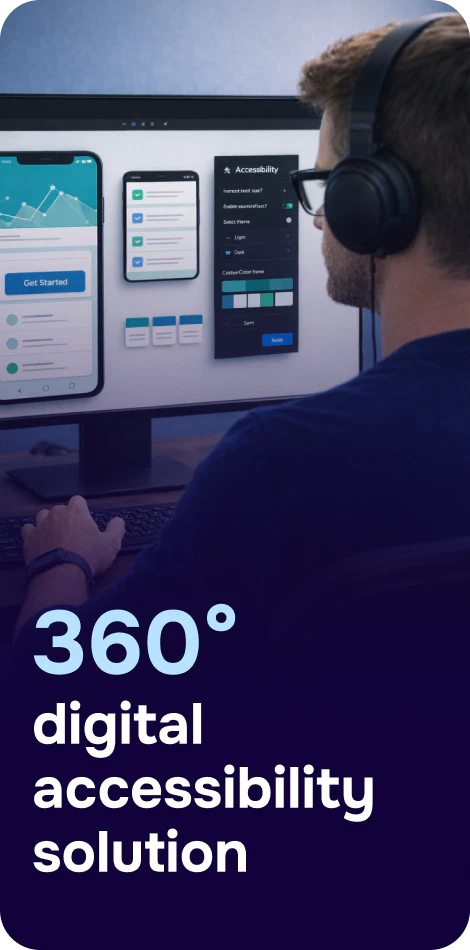
Tools can help you find and track issues over time. For example, Corpowid (corpowid.ai) can run automated accessibility audits and monitoring to surface recurring WCAG problems (like missing labels or unclear error associations) that often amplify cognitive load in forms and workflows. You can then prioritize fixes alongside UX writing improvements.
Many organizations encounter accessibility requirements through procurement (VPATs), audits, and regulatory expectations. While VPATs aren’t “COGA checklists,” strong cognitive accessibility practices can improve your documented conformance and real user outcomes—especially around forms, error handling, and consistent navigation. For procurement-focused guidance, VPAT Consulting: A Practical Guide to Accessibility Compliance and Procurement Success is a helpful companion.
Regional context also matters. If your services reach different markets, align your COGA work with broader accessibility maturity and local expectations; Turkey’s Web: Open for Everyone or Just for Some? offers insight into accessibility gaps and opportunities.

Cognitive accessibility is easiest to maintain when it’s part of a continuous lifecycle: audit, fix, re-test, and monitor as content and features change. If you’re building that operational rhythm, Corpowid (corpowid.ai) supports ongoing monitoring and structured accessibility workflows so improvements don’t fade after a one-time project. You can also learn more about this kind of approach in Closed-Loop Accessibility Lifecycle of Corpowid AI.
When you prioritize clarity, predictability, and error-proofing, you’re not only “doing accessibility.” You’re making your digital experience calmer, faster, and more trustworthy for everyone—especially for users who need the web to be understandable, not just technically usable.
Corpowid has been recognized by Gartner, a leading global research and advisory firm, for our innovation and performance in digital accessibility. These badges reflect our commitment to creating inclusive, AI-powered web experiences.


 TR
TR