The Netherlands is famous for turning constraints into craft: land reclaimed from the sea, cities shaped around bicycles, and public spaces designed for flow, safety, and shared use. That same design sensibility—practical, human-centered, and quietly rigorous—maps well to digital accessibility. In the “art of accessible design,” beauty isn’t separate from usability; it’s proven through real-world use by people with different abilities, languages, devices, and contexts.
Accessible design is not a Dutch-only idea, of course. But the Netherlands offers a useful lens: think systems, think inclusivity, and optimize for everyday life. For websites and digital services, that means aligning with WCAG, building inclusive UX patterns, and staying ready for European compliance expectations.
Dutch design is often described as functional, minimal, and socially aware. In public infrastructure, that can look like step-free routes, clear wayfinding, and multimodal transportation. Digitally, those values translate into principles that WCAG already promotes:
Accessibility isn’t a “special mode.” It’s a quality standard. And like any quality standard, it becomes easier and cheaper when it’s embedded early—during design, content planning, and component development.
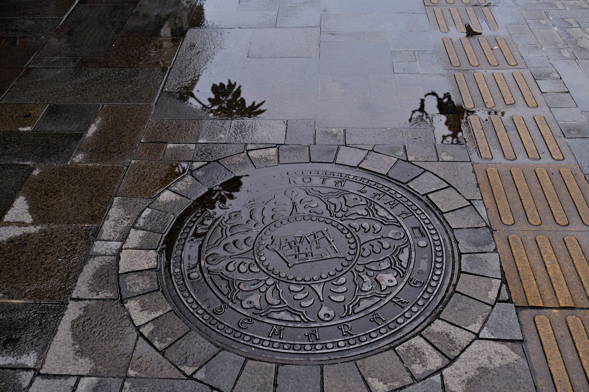
Good urban planning anticipates edge cases: night-time navigation, bad weather, tourists, aging residents, and people carrying groceries. Websites face similar realities: users on small screens, keyboard-only navigation, screen readers, low vision, temporary injuries, slow connections, or stressful environments.
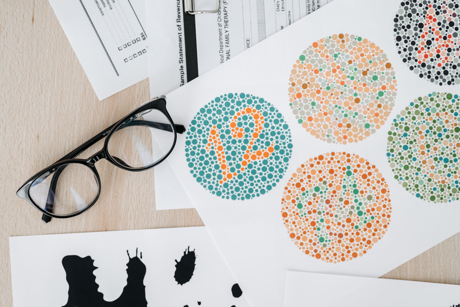
Minimalism can help, but only if it’s readable. WCAG’s contrast requirements are a frequent stumbling block in modern interfaces with light grays, subtle borders, and thin typography. Ensure:
One reason this matters: most accessibility failures are not exotic. As highlighted in 94.8% of Websites Fail Basic Accessibility — Is Yours One of Them?, common issues like missing form labels, poor contrast, and keyboard traps are still widespread—and preventable.
In Dutch cities, bike lanes are clearly separated because the “interaction model” must be predictable. On a website, predictability shows up in keyboard navigation and focus order. Users should be able to:
Design teams sometimes remove focus outlines for aesthetic reasons. That’s like removing road markings because they “clutter the view.” The interface may look cleaner, but it becomes harder—and sometimes impossible—to use.
The Netherlands is multilingual and internationally connected. Accessible content anticipates language diversity and varying literacy levels. For WCAG-aligned understandability, prioritize:
Inclusive UX also reduces support tickets, abandonment, and form drop-off—making accessibility both a compliance and performance win.
Accessibility relies on structure. Assistive technologies interpret code, not visual styling. Robustness means using semantic HTML (buttons for actions, labels for inputs, headings in order) and ARIA only when necessary—and correctly. This is where design systems shine: build accessible components once, then reuse them everywhere.
Accessible design increasingly intersects with legal and procurement requirements across Europe. If your organisation serves EU customers or operates across borders, it’s wise to treat WCAG conformance as a baseline. The upcoming enforcement landscape is a major driver, and the European Accessibility Act is a particularly important milestone for many digital products and services.
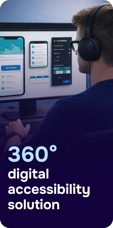
Practical takeaway: don’t wait for a complaint to discover barriers. Create an accessibility roadmap that combines quick fixes (like missing labels and contrast issues) with longer-term changes (like rebuilding inaccessible components). Tools such as Corpowid (corpowid.ai) can help teams run automated accessibility audits and continuous monitoring to spot regressions early—before they reach users.
For larger organisations, accessibility isn’t only a design and engineering concern—it’s part of procurement and risk management. Vendors may be asked for accessibility documentation, and internal stakeholders may need clarity on what “compliant” means in practice. If you’re navigating accessibility claims in purchasing decisions, VPAT Consulting: A Practical Guide to Accessibility Compliance and Procurement Success offers a helpful framework for evaluating and communicating conformance.
Accessible design becomes sustainable when it’s measurable. In practice, that means:
Automation alone won’t catch everything, but it’s a strong foundation for consistency—especially across large sites. Corpowid (corpowid.ai) supports ongoing monitoring so teams can see when new releases introduce issues, helping accessibility stay part of normal QA instead of an occasional project.

The Dutch approach to design often treats systems as living things—maintained, improved, and refined over time. Accessibility works the same way. It’s not a one-time remediation sprint; it’s a product quality mindset.
And it’s global. Different countries face different barriers, but the principle is universal: the web should be usable by everyone. For another perspective on how accessibility gaps show up in real life, see Turkey’s Web: Open for Everyone or Just for Some?, which highlights how uneven implementation can limit access to essential services.
Accessible design becomes an “art” when it looks effortless to users—because the hard work happened upstream: thoughtful content structure, robust components, and inclusive testing. To keep it repeatable, embed accessibility into:
The Netherlands reminds us that great design is civic-minded: it respects how people move, read, hear, and decide. In digital products, WCAG and inclusive design are the tools that turn that philosophy into reliable experiences—ones that work for keyboard users, screen reader users, people with low vision, and everyone navigating under real-world constraints.
If you treat accessibility as a craft—measured, maintained, and improved—you don’t just reduce risk. You create calmer interfaces, clearer journeys, and better outcomes for all users.
Corpowid has been recognized by Gartner, a leading global research and advisory firm, for our innovation and performance in digital accessibility. These badges reflect our commitment to creating inclusive, AI-powered web experiences.


 TR
TR