Turkey’s digital ecosystem is expanding quickly: public e-services, university portals, banking apps, e-commerce marketplaces, and news sites shape everyday life. But one question keeps coming up for anyone building or buying digital experiences: is Turkey’s web truly open for everyone—or only for users who see, hear, read, and interact in a narrow “default” way?
Digital accessibility isn’t a niche enhancement. It’s the difference between independence and exclusion for people who are blind or have low vision, Deaf or hard of hearing, have mobility limitations, cognitive disabilities, chronic conditions, temporary impairments, or simply use older devices and slow connections. In practice, accessibility is also about better usability for everyone—especially on mobile.
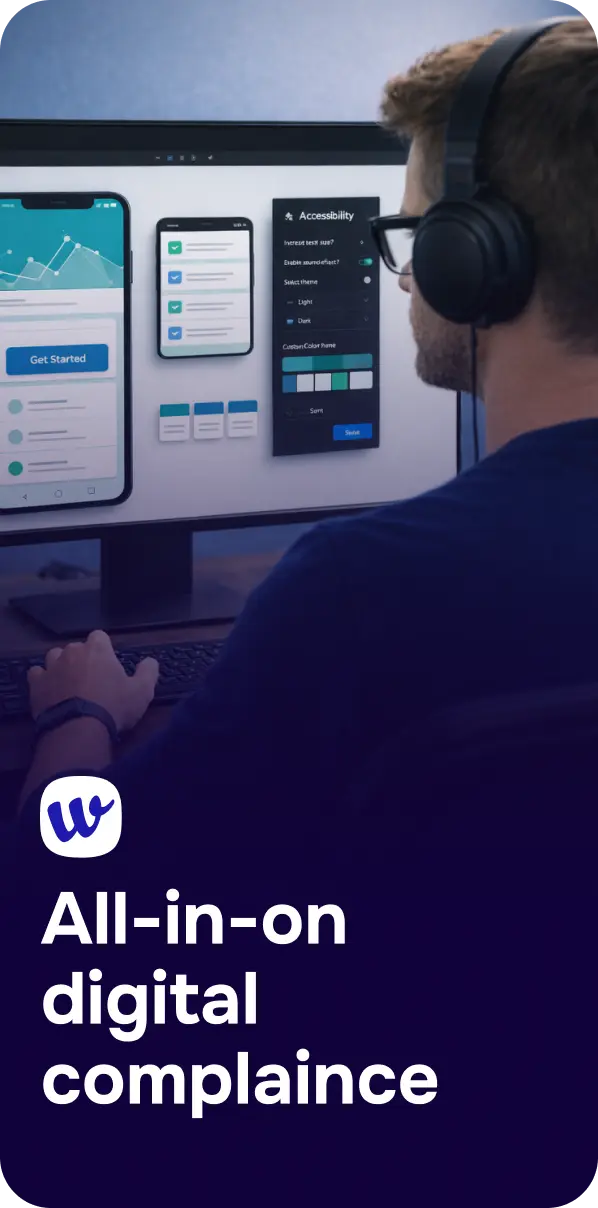
Accessibility means people can perceive, understand, navigate, and interact with digital content—using assistive technologies (like screen readers), keyboards, voice control, captions, and settings like zoom or high contrast. The global standard that most organizations align to is the Web Content Accessibility Guidelines (WCAG), typically aiming for WCAG 2.1 or 2.2 at Level AA.
When sites miss the basics, the web becomes “open” only to some. A few examples users experience every day:
And these are not edge cases. If you’ve read 94.8% of Websites Fail Basic Accessibility — Is Yours One of Them?, you already know how common foundational barriers are across the internet. Turkey is not immune to this pattern.
Accessibility gaps are rarely about bad intentions. More often, they’re the result of common process and design realities:
Turkey is highly mobile-driven. But “mobile-first” sometimes becomes “visual-first”: small tap targets, dense layouts, hidden labels, and gesture-only interactions. WCAG-friendly mobile design is absolutely possible, but it requires deliberate choices—like sufficient spacing, clear focus states, and consistent headings.
Teams ship quickly, especially in e-commerce and fintech. Without guardrails—component libraries, automated checks, and clear acceptance criteria—accessibility regressions return sprint after sprint.
Widgets and overlays can help with certain user preferences (like text size or contrast). But overlays can’t reliably fix missing semantic structure, broken keyboard navigation, or unlabeled controls. Treat them as a supplement, not a substitute for accessible code and content.
From application forms to policy documents, inaccessible PDFs remain a major barrier. If the “real” information is in a scanned PDF, the site may look modern while still being unusable to assistive technology.

If you’re deciding where to start, focus on changes that unlock core journeys: discovering information, registering, signing in, paying, contacting support, and accessing public services. These high-impact WCAG priorities come up repeatedly:

Accessibility becomes durable when it’s built into governance: how you buy technology, how you define “done,” and how you measure quality. Many organizations in Turkey work with global partners, platforms, and vendors—making accessibility requirements in procurement increasingly relevant. If you’re evaluating vendors or delivering software to enterprise or government stakeholders, the practices described in VPAT Consulting: A Practical Guide to Accessibility Compliance and Procurement Success can help you ask the right questions early (and avoid expensive retrofits later).
Internally, accessibility isn’t owned by one specialist. Designers, developers, QA, content, product owners, and leadership all influence outcomes. Teams that treat accessibility as “someone else’s job” often ship inaccessible experiences even with good intentions. A practical way to avoid that is to define responsibilities and rituals—training, checklists, design reviews, and release gates—like those covered in Building an Accessibility Culture: Embedding It Into Every Role.
Accessibility doesn’t have to be a massive one-time project. The most successful approach is iterative: audit, fix, prevent regressions, and communicate progress. Here’s a realistic path for teams managing Turkish-language sites and services:
Start with templates and top journeys (home, category, product, checkout, login, support, forms). Automated scanning will catch many issues quickly, but pair it with manual checks (keyboard-only, screen reader smoke tests, zoom/reflow). Tools like Corpowid (corpowid.ai) can help you run automated accessibility audits and ongoing monitoring so recurring issues are found early rather than after a redesign.
Prioritize issues that prevent task completion: missing labels, broken focus order, inaccessible modals, non-text contrast failures, and invalid heading structure. Track fixes by template so improvements scale across the site.
An accessibility statement isn’t just legal protection—it’s user support. It should explain the standard you target, known limitations, and a contact method for reporting barriers. Corpowid (corpowid.ai) can also support teams with accessibility statement tooling, helping keep commitments and updates consistent as the site evolves.

When accessibility is framed only as compliance, it’s easy for it to compete with “more urgent” roadmap work. But accessible design improves conversion, reduces support costs, and strengthens brand trust—especially in high-stakes journeys like banking, telecom, education, travel, and public services. If you need internal alignment, the mindset in Accessibility as a Competitive Advantage, Not a Compliance Checkbox is often what turns accessibility from a side project into a product quality standard.
Budget conversations matter too. Accessibility work is easier to fund when outcomes are measurable: fewer abandoned forms, higher task completion, reduced call center volume, improved SEO due to better structure, and fewer emergency fixes. For practical ways to quantify and defend that investment, see How to Prove Accessibility ROI to Keep Budget (and Your Job) in 2026.
Turkey’s web can be open for everyone, but it requires intentional, ongoing accessibility practice: WCAG-aligned design and development, real testing, governance that survives team changes, and transparent communication with users. The payoff is bigger than compliance—it’s a digital experience that welcomes more customers, serves more citizens, and reflects a modern standard of quality.
If you’re ready to move from “we should” to “we did,” start with an audit of your most important user journeys, fix the blockers, and put monitoring in place so accessibility doesn’t fade after the next release.
The 5th Africa Social Impact Summit is a key moment to move from inclusion goals to measurable digital accessibility outcomes. Here’s what to expect—and how to turn summit insights into WCAG-aligned action.
Corpowid has been recognized by Gartner, a leading global research and advisory firm, for our innovation and performance in digital accessibility. These badges reflect our commitment to creating inclusive, AI-powered web experiences.


 TR
TR