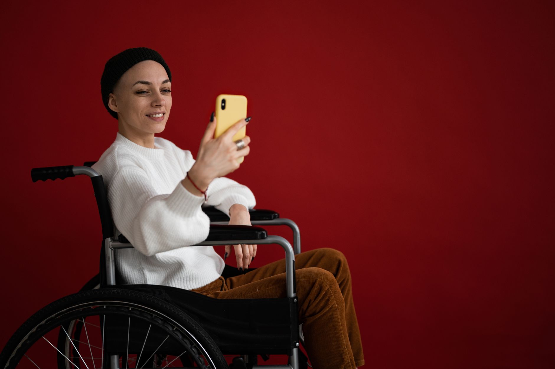
If you're thinking about making your mobile app easier for everyone to use, you're already on the right path. Accessibility isn’t just about checking WCAG boxes — it’s about making sure that people with different needs can actually enjoy your product.
In the first part of this series, we talked about what accessibility really covers: vision, hearing, motor skills, and cognitive needs. Once you understand how differently people experience mobile devices, the way you design apps changes forever.
Now let’s dive into ten practical, real-world tips that will immediately make your app more accessible — especially on iOS (though most apply just as well to Android).
You know how some people increase the system font size on their phone because they hate tiny text? Dynamic Type is what allows apps to respect that preference.
When your app supports Dynamic Type:
Apple’s App Store app is a perfect example — bump up the font size and the entire layout gracefully adjusts.
If you want to implement it:
adjustFontsForContentSizeCategoryThis sounds technical, but in practice it just means: let users decide how big or small text should be.
Let’s start with something simple but surprisingly impactful: colour contrast.
A lot of people assume colour contrast is only relevant for people with vision impairments or colour blindness — but even fully sighted users struggle with poor contrast under bright sunlight. If someone has to squint to read your app, something’s wrong.
To avoid this:
On iOS, you can quickly check this with Apple’s Accessibility Inspector, which flags colours that don’t meet accessible thresholds.
Good contrast is one of those small changes that benefits literally everyone, not just users with visual difficulties.

This one seems obvious, but you’d be amazed how many apps still place important text inside an image.
Here’s why it’s a bad idea:
Whenever possible, keep real text as real text.
If the image is:
…then it definitely shouldn’t contain text.
Custom UI elements are fun to design, but they can be extremely time-consuming to make accessible.
Standard, native components:
This doesn’t mean you should never build custom elements — just make sure they behave like their native counterparts. If VoiceOver can’t identify your custom widget, users who rely on screen readers will be completely lost.
A simple interface doesn’t just look better — it’s easier for people with cognitive disabilities, visual impairments, older users, and VoiceOver users.
When your design relies on clarity over complexity:
Think of your UI like a conversation: direct, focused, and not shouting five things at once.
Custom gestures can feel cool and futuristic, but they also:
If you include gestures, treat them as shortcuts — not the only way to perform an action.
Also: never trigger destructive actions (like deleting something) with just a swipe. Always confirm.
This may be the most important point of all.
Most designers and developers do not have the lived experience of navigating the world with visual, auditory, motor, or cognitive disabilities. So the best insights often come directly from users.
Make it easy for them to reach you:
Real users will tell you what works, what’s confusing, and what isn’t accessible yet. Their input can guide your decisions better than any checklist.
Be open, be responsive, and be willing to learn.
Everyone has tapped the wrong thing at least once — especially when the button is absurdly tiny. Maybe you were trying to zoom into a photo and accidentally liked it. We’ve all been there.
To avoid awkward moments:
This helps people with motor impairments, tremors, or limited dexterity, but it also makes your app feel nicer and more forgiving for everyone.
Here’s a quick exercise: imagine you have low vision and you’re signing into a brand-new food delivery app. You enter your email and password, tap “Log In,” and… nothing happens. No feedback. No change. Just the same screen.
What you don’t see is that the designer changed the email field to red to indicate a typo. Since that feedback only relied on colour, it excluded anyone who can’t perceive colour differences.
A better approach is to always combine:
So instead of only changing the border to red, show a message like:
“Invalid email address. Please check again.”
And for VoiceOver:
“Unable to submit. Invalid email address.”
That way, users get the message no matter how they interact with your app.
One of the best things you can do is actually open your app and try using it with VoiceOver turned on.
Before testing, get familiar with the basics:
Then ask yourself:
Apple’s Accessibility Inspector will also walk you through issues screen by screen, which is extremely helpful for catching what you may not notice on your own.
You now have a full list of practical ways to make your mobile app friendlier, more inclusive, and easier to use for people of all abilities. Accessibility isn’t something you finish once — it’s something you improve a little more each time you test, listen, and refine. And the people who rely on these features will always appreciate that effort.
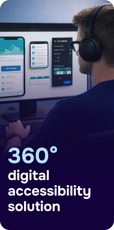
If you want to take accessibility to the next level without drowning in manual work, here’s a simple next step:
Corpowid’s AI‑powered mobile accessibility solution helps you test and fix accessibility issues across iOS, Android, and even APK files, with real‑time scanning, both automatic and manual testing, and AI‑generated fix suggestions.
Whether you're improving an existing app or building a new one, Corpowid makes accessibility faster, smarter, and easier.
Corpowid has been recognized by Gartner, a leading global research and advisory firm, for our innovation and performance in digital accessibility. These badges reflect our commitment to creating inclusive, AI-powered web experiences.


 TR
TR