An Accessibility Contrast Checker is a specialized digital tool or software utility designed to evaluate and recommend optimal color combinations for foreground (text, icons) and background elements on a website or digital interface. Its primary function is to ensure sufficient visual contrast to make content easily readable and discernible for all users, particularly those with visual impairments or color blindness.
Consider the ease with which you can read text on a dark background versus text on a background of a very similar, light color. The difference in readability is immediate and profound. This is because our human perception is highly attuned to color, and the contrast ratio between colors plays a pivotal role in visual clarity. On a website, this ratio isn't just about aesthetics; it's a critical factor in usability for everyone, especially for individuals with low vision, color deficiencies, or age-related visual changes.
This is precisely where an accessibility contrast checker becomes an indispensable tool. It analyzes various combinations of foreground (e.g., text, buttons, and links) and background colors, calculating their contrast ratio based on mathematical formulas. The tool then provides feedback, often with clear indicators, on whether these combinations meet established accessibility standards. This allows designers and developers to make informed choices that optimize readability and reduce eye strain.
The Web Content Accessibility Guidelines (WCAG), widely recognized as the international standard for web accessibility, define specific requirements for contrast ratios:
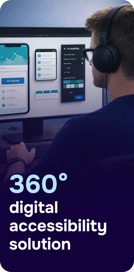
Meet the complete accessibility solution by Corpowid
Easy to install and fully customizable, our intelligent solution delivers flawless accessibility on mobile and desktop. Improve usability, boost SEO, and stay compliant — all with one powerful tool.
Corpowid has been recognized by Gartner, a leading global research and advisory firm, for our innovation and performance in digital accessibility. These badges reflect our commitment to creating inclusive, AI-powered web experiences.


 TR
TR